

I initiated, designed, and operationalized Numerade’s first web design system to bring structure to a rapidly scaling product organization.
I led system architecture, secured executive buy in, partnered with engineers on feasibility, and rolled it out to a team of 50+, cutting build time by on average 40% and reducing QA inconsistencies by 30%.
As Numerade expanded across platforms like AI tutoring, collaborative learning, and educator tools, the product experience became increasingly inconsistent. UI patterns were duplicated, visual standards drifted, and teams lacked a shared system for building new features efficiently. Bungalow was created to establish a scalable design foundation by standardizing components, defining visual and interaction principles, and aligning design and engineering around a unified system that could support rapid product growth.
Problem
When I joined Numerade, the product UI was inconsistent across surfaces. Components were duplicated, styles drifted, and engineers were recreating patterns from scratch. As we expanded to new features, the design debt compounded:
The Opportunity
Build Bungalow, Numerade’s first centralized web design system, a scalable foundation for product consistency and speed.
Scope & Reach
Rolled out to 54 internal team members (4 product designers, 30+ engineers, PMs, Marketing, Growth & QA)
Student learning flows, Ace AI Tutor, Study Groups, Flashcards, Educator Dashboards, Onboarding & Paywalls
Product, Engineering, Growth & Marketing
What I built
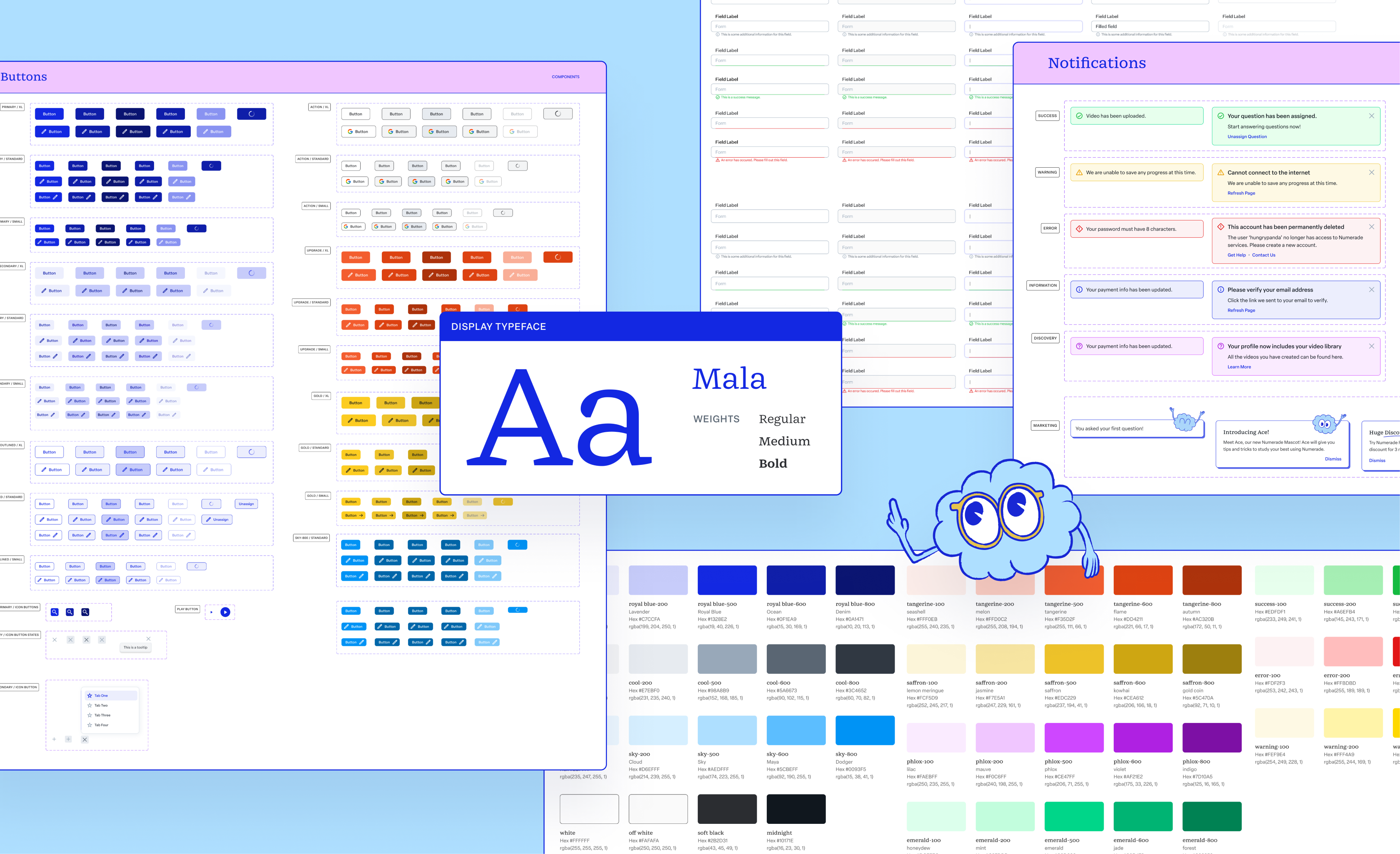
Color System
Numerade serves high school and college students, a digitally native, Gen Z audience. The color system needed to feel energetic and modern, while maintaining trust in an educational context. I structured the system into three distinct color tiers, each with clear purpose and usage rules.
Core Colors
Implemented with graded swatches to support hover, active, disabled, and background states.
Used for lighter UI treatments, background accents, and layered depth.
Scaled greys, white, and black, Structured for typography hierarchy, backgrounds, dividers, and elevation layering.
Decorative Colors
The decorative palette adds expressive range across both marketing and feature level branding within the product. Each includes graded swatches for flexible use across backgrounds, tags, highlights, and feature differentiation.
System Colors
System colors are reserved exclusively for product state communication and should not be used in marketing or decorative contexts. These colors prioritize contrast, immediacy, and semantic recognition to support user comprehension and accessibility.
Cross-Functional Collaboration
Before building 📋
Throughout the process 🚆
I presented 📊
I secured buy-in from 🤝
Workflow Efficiency
Reduced design iteration cycles by 30%
Reduced time to create new screens by 40%
Decreased QA UI bugs by 30%
Designers could now
Build new flows using existing components
Focus on solving problems instead of recreating UI
Prototype significantly faster
Operational Leverage
What this says about me
No one handed me a brief that said "build a design system." I just couldn’t ignore the inconsistency anymore. As we scaled, things were starting to feel messy with the duplicated components, slightly different button styles and engineers always rebuilding patterns from scratch. So I decided to fix it.
In a fast moving environment with no extra resources, I took the initiative to create the structure we were missing. What started as a side effort became foundational infrastructure that made our work faster, more consistent, and way more scalable.